The biggest feature I notice missing in almost all Lemmy apps, is jumping to the top on the first tap of the tab icon of the view you’re in.
E.g. you’ve scrolled down a bit while in the Posts tab, then you tap the Posts icon, in Apollo, it would jump to the top of the list view in Posts, then second tap would take you to the communities subscribed slideout view.
Would love to see both the first and second tap functionality added to the tab icons as it’s a great quality of life feature IMO.
This is ALMOST ready (famous last words, once again) - I’ve been using it myself for the past few weeks, and literally just merged it into the main repo 🥲 Feel free to chime in on possible customization options 😎
Almost made it into the last TestFlight build, but I had to rework the entire thing because of a nasty lil bug that made it unusable.
Technical Stuff: Programmatic dismissal and UI dismissal via SwiftUI environment have different behaviours…the former was what I built it with initially, but it totally wasn’t built for this use case 😕
Yeah, I noticed this myself as a former Apollo user that I keep tapping the icon and nothing happens. While I wait for this feature to be implemented I resort to the good ol’ tapping the status bar.
I forget if Apollo’s was the system behaviour (I.e. skip all the intermediate pages and go the first page if you have a bunch of pages showing, then scroll to top).
We currently have it so it goes back to the previous page, one by one.
I forget if that’s how Apollo did it or not. In my mind I had thought it scrolled to the top of the current view first then went back one. Too bad we can’t check 🥲
Having used the branch for a day, I think it would be cool if we could scroll to the top of the current view first. Like if I’m on a long thread. Tapping the tab icon, would be handy to go up to the top first. But I can also see why someone would want to have it go back to the previous view instead. Maybe if there’s a way to swipe forward to the same spot you were just at. 🙏
Absolutely haha, ideally you’d be able to customize the behaviour.
Hopefully this feature will be out soon :) The team is busy getting other issues closed first. Plus, I’d like to wait for an iOS 17 build to go out first. I’ve added tap to scroll to top to some views in the meantime :)
Swipe to go forward is….another problem haha 😅 I wouldn’t hold your breathe for it (super easy to do in UIKit, but much? trickier in SwiftUI)
Understandable! Y’all are doing great work! Any QoL improvements are welcome 🙌
deleted by creator
Here’s a preview of this feature, for those technically-inclined 🚋🫡
Latest 1.1.1 update is soooo close 🥹🙏🙌🙌🙌🙌
The tab bar navigation branch has just been merged in ahaha🤭
Oh my goodness 🫡 thank you for all the hard work!! I can’t wait 😍
I’m testing it now! This seems very close to what I was looking for 😍🫶 you’re amazing 🙌
I’ve been using this build for a week or so now. And I gotta say, it’s definitely the missing feature for me 🥲 Even with the little delay in tapping the icon, I am finding it very much an improvement for me to use the app ❤️
I feel you 😥 The performance issue really is the major hurdle here. I’m trying to figure that one out I promise 🥹
I believe you! If there’s anything I can do, I am available and willing 🫡
What iPhone are you using btw, an older slower one by any chance? 👀
Nope! I’m using a iPhone 12 Pro!
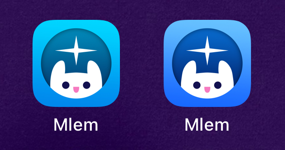
I just want to point out, that I prefer the classic icon in this build over the TestFlight build 🙏

Should check out the Stargazer icon too 😏
👀 I don’t see that one! Not in either build 🤓
EDIT: I see it now! In the RC 😍 so cute!! Damn that search page is so handy!
Anyway you can update this branch? 👀🙏🥹
EDIT #2: I rebased the branch locally to the RC commit! This runs really well 👀🫶
Nice :) I’ll have to rebase sometime this week 😅 Hopefully this will make it after we update the app to support Lemmy v0.19 🫶
Needless to say, I can’t flipping wait 😍
Any updates to this? I notice the branch is pretty out of date now. It’s way out of my current abilities to update the branch myself now 🥲
Will do this sometime this week, then get the feature merged in!
In the meantime, there’s a temporary thing coming before that lets you tap to scroll to top (not the same PR or feature set)
I am excited 🙌
Branch is ready, would love some testing before we start looking at merging it in 🫶
Testing now! Works like before :) Still has the delay before a jump to top, but everything is working well :) I notice the latest Stargazer icon has a different background hue. Is that intended?

Probably? I haven’t been paying attention to the icon stuff 🙈 yea I’m not happy about that delay either
Understandable! The delay isn’t so bad, it’s noticeable but it’s not unbearable. Just a small delay :) I like how the app feels now tho! This is great 🔥


