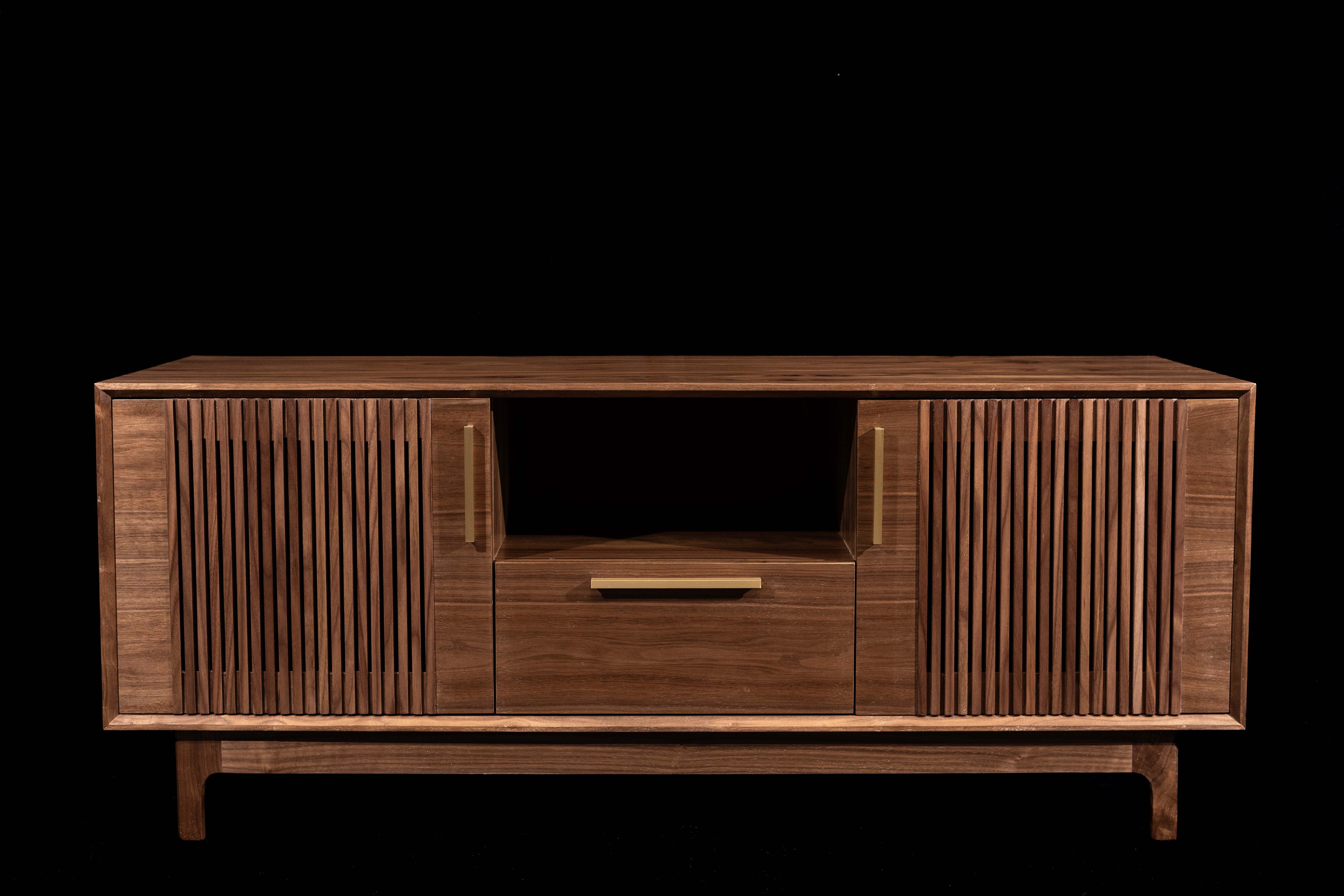


That wavy bevel looks like an error (doesn’t match the crisp style of the piece).
The lighting is super harsh! There’s little highlights all over that look like chips and tear-out in the veneer which I doubt look that way in person based on how nice the joints are on the solid wood parts.
As someone who used to sell handmade wood products in the past: Don’t do it unless you know what you are getting yourself into. It takes the fun out of making. You need to work within a budget and with time constraints and any flaw or mistake means lost time and lost money.
It started as a hobby for me, then people around me asked to make them some things, which I did. Then it snowballed into people who had heared from a friend of a friend kind of thing. At first I liked the attention/praise and was honored people liked it enough to have me make it for them. I also liked the idea of making and instead of it costing a lot of money it would be cost neutral or even make a few bucks. Then as time went on I started to hate it, gave me a lot of stress and I gave up on making for a couple of years.
Only recently I once again made a piece and fell in love with it again, it’s an eyecatcher in my office and I love it. Everyone who sees it comments on it. Some people have asked for me to make something after seeing it, but I’ve said no. Only said yes to my best friend who asked without any deadline and only to pay for the materials and not the hours, so it wouldn’t be a job, just a shared project kind of thing.
But if it works for you, more power to you, good luck!
I’ve lost two very serious hobbies this way. If you love something, don’t turn it into work. I actually just recently got back into one after >10 years away.
Before the pandemic, my full time job was project manager of a rapid prototyping and custom manufacturing shop. I built all kinds of stuff, from touch screen information kiosks, weird awards and trophies often that did something, electronics. Several products I designed for customers are on Amazon right now. We also ended up doing a lot of unobtainium car and motorcycle parts.
I’ve been in that place of seeing two parts I just put a lot of work into making not fit together, and the amount of time it will take me to fix it means we’re not turning a profit on this project. I’ve had to show certain customers to the local patch of pounding sand. I’ve had more work than I can do and not enough work to pay my bills.
And I’d rather be back at it, possibly as owner of the company this time, than what I’m doing now. I’m strongly considering hanging a shingle.
If I were you, I don’t think I’d be very happy with these pictures. It almost looks more like pictures in the customer review section pointing out defects than marketing photography.
Like that wavy bezel, which might be designed to look like a live edge or hand hewn rather than machine routed, but from this angle in this light it just looks like sloppy router work.
The front view is the least bad picture. But between the VERY white light which is VERY bright and VERY directional and the stark black background it feels like this picture was taken in orbit. I could understand keying out the background for display on a website, especially one with dynamic color backgrounds or light/dark modes, but I don’t know about solid black.
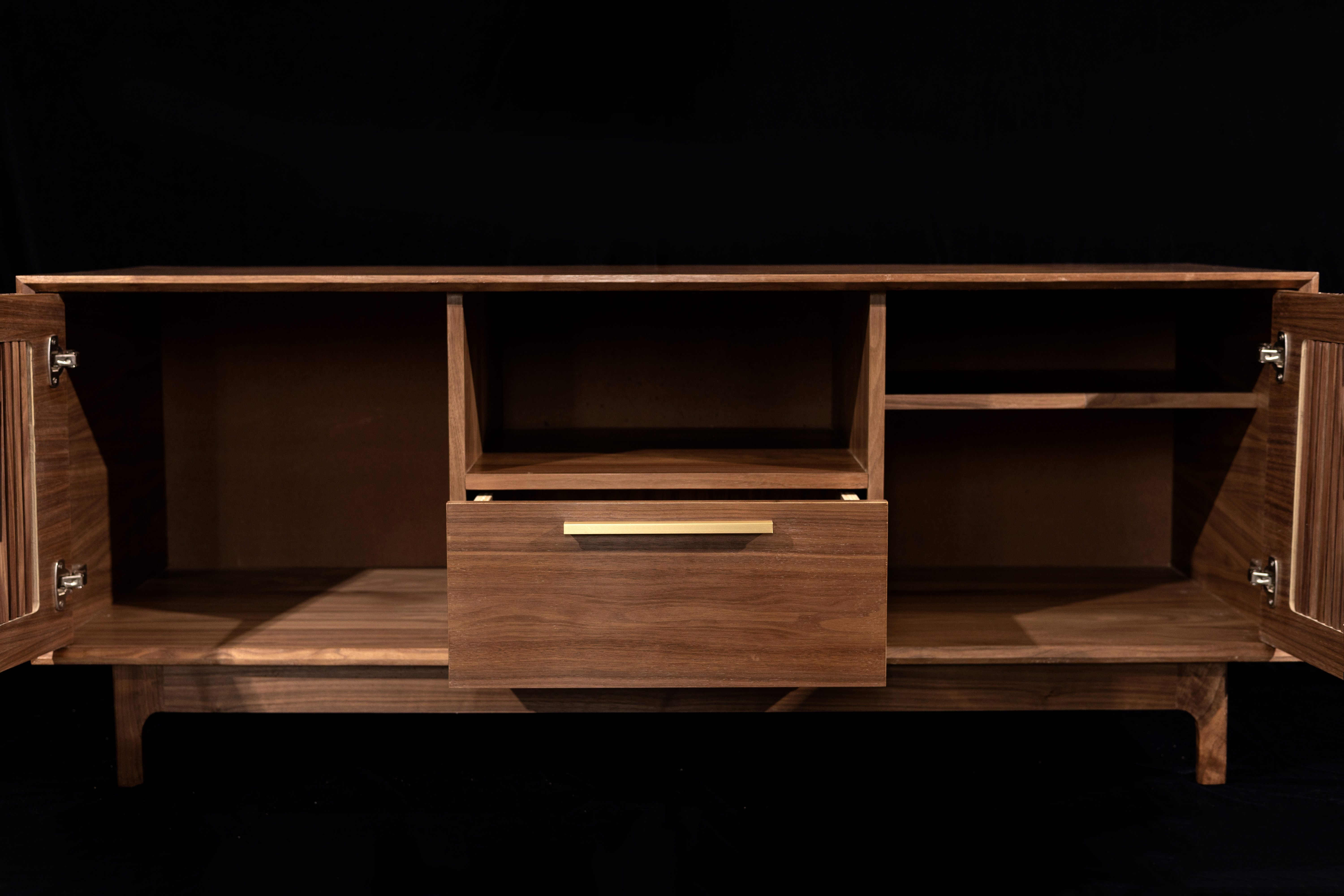
The opened shot looks like it was taken from the same angle as the front view shot. The doors being cut by the edge of the frame looks awkward; since its from the same angle as the front view shot it feels like the photographer just opened the doors with the same camera set up and didn’t really care. That and from this angle you can’t tell how far the drawer pulls out, how deep the drawer is, or what features are inside. Is it divided for storing CDs or cassettes, does it have some other feature, or is it a big open drawer?
Then there’s the shot of the seam between two boards in a panel. If I had gone through the trouble of matching the grain on the ends of the doors with the drawer front like you did, and my product photographer came back with this specific shot, I think I’d have to remind myself not to take it personally.
I understand it’s supposed to be a “look at the gorgeous walnut” shot (by the way, it’s gorgeous walnut, and finished very nicely.) I’ve just been sitting here thinking about my own projects with edge jointed panels, and all the places where I matched the grain so beautifully you’d never spot the seam, and where I had no choice but to put straight grain next to figured grain, and which of these seams I’d want my photographer to shoot in close-up. And then arguing with myself about whether the typical citizen who buys instead of makes his furniture would understand, notice or care, if they’d see it as a mark of quality as it’s obviously solid boards and not veneered plywood or worse, or scoff at it not being a 3" thick solid slab, which seems to be all the rage these days.
Suggestions:
Take some overall shots from different angles. Show how deep the cabinet is.
Instead of the one front shot of everything open, take individual shots of the left side open, the right side open, and the drawer open, kind of like that half-front shot.
I would suggest taking at least a couple shots of it in situ, put some hi-fi gear and some album covers and knickknacks on it, and some speakers on either side, in a nicely decorated room. Say “this could be your house” to me.
additional suggestion - for close up shots use a wide angle lens or a shallow depth of field - to distance your photo from the “bad review pointing out flaws” look
Is the wavy bevel a design choice?
Yes. It’s only wavy right there and one other spot. Didn’t want it to look too factory-made. Wanted it to look and feel more unique and hand made
If it were a more rustic piece, the wavy bits would make perfect sense. The piece shows skill that is betrayed by the bevels.
Someone will love that piece, but most wouldn’t get it. If you made that intentional roughness a signature of your work, in a few centuries people may enthusiasticly bid to have one of your pieces. Make sure you get a custom branding iron to mark your work.
If I was browsing through furniture on Etsy and the first image was that imprecise looking bezel I would close your shop and keep looking. It just looks like sloppy cutting rather than the hand of the artist. I would find other ways to show the artist’s hand, maybe a hand-carved element or something. Especially for this style of piece which is emphasizing clean lines, having a wavy line looks sloppy not intentional.
The rest of the work should make the wavy bits obvious as being intentional, however questionable a decision it was to typical taste.
It isn’t a style that is for everybody, but there is a shoe for every foot.
Great work on the actual product … it’s beautiful.
But I don’t like the way the photographer set up the images. The black background makes it look like this was all image generated by AI or something … it makes it look … fake … or like it is floating in empty space. It makes it look like it is a digital creation from an AutoCAD program. The dark background makes it look dark and ominous.
Instead of a solid studio background, it might be nicer to place it in a neutral background - nothing too flashy that would detract from the furniture. Maybe a blank white wall and sitting on a hardwood floor and all bathed in natural soft light.
EDIT: I wondered if maybe you might have other photos in your history and you do … your photo from a few days ago displays this furniture in a lot more dramatic way than in the professional photographer images
https://lemmy.ca/post/19188721
… but this is just my opinion … I may be right or wrong … it is just my personal take … otherwise, I still love the furniture and I can absolutely appreciate the time, effort, expertise and skill that went into making it.
Yeah the lighting was not suitable for the subject.
If they had to use a plain background, white or grey would be much better than black.
I hope OP didn’t pay much for this photographer.
It looks well made. The horizontal grain against the vertical slats is jarring in my opinion. It can be a rough ride selling furniture, especially if your pieces don’t have an exceptional or completely unique style/form. Most of my (not many) sales came from word of mouth. I made massive efforts in online marketing and makers fairs etc, none of that resulted in sales. It can take a long time to establish yourself and find the right niche. Even the Eames had Herman Miller selling/licensing for them.
Wow, that’s incredenzable!
Do not put your images on black unless you are trying to tease or hide a product. Go with anything brighter.


