It looks like there’s nothing I can say to make you see, but even accounting for inflation, the cost of living has been outpacing wages for decades! That’s why the average US worker in the 1950s could support a home with their wages alone, but today, two people working full-time jobs still can’t afford a home.
That’s because the cost of living has been outpacing wages.
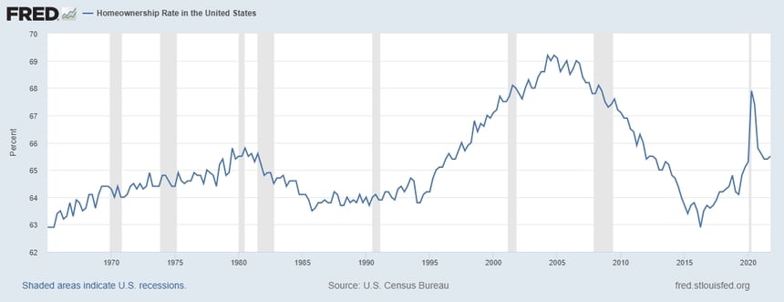
Your graph doesn’t actually show that, as that source doesn’t include the first year referenced on the x-axis. Even then, it actually shows an upwards trend into the 1970s, so I don’t even know what you’re talking about with this. How about this, why don’t you post a more recent chart from the same source shown in the bottom of the image?
What a shock, but it seems to show homeownership is trending downwards at a faster rate than in any 4-year period in the last 44 years, which contradicts the bullshit you’re trying to peddle that things are better than they’ve ever been. If the current trend holds, homeownership will be at its lowest rate in over 60 years in just over another 4.5 years. The currently available options only let you go back as far as New Year’s Day, 1980.
It looks like there’s nothing I can say to make you see, but even accounting for inflation, the cost of living has been outpacing wages for decades! That’s why the average US worker in the 1950s could support a home with their wages alone, but today, two people working full-time jobs still can’t afford a home.
That’s because the cost of living has been outpacing wages.
But that’s only true in the 1970s and 1980s. In recent years wages have outpaced inflation
Why is home ownership now higher than before?
you keep reposting this shit graph even after it’s been pointed out that it’s meaningless…
Nobody actually addressed it, they just kept saying it’s bad without any argument. Why didn’t people buy homes in the 1960s?
Your graph doesn’t actually show that, as that source doesn’t include the first year referenced on the x-axis. Even then, it actually shows an upwards trend into the 1970s, so I don’t even know what you’re talking about with this. How about this, why don’t you post a more recent chart from the same source shown in the bottom of the image?
What a shock, but it seems to show homeownership is trending downwards at a faster rate than in any 4-year period in the last 44 years, which contradicts the bullshit you’re trying to peddle that things are better than they’ve ever been. If the current trend holds, homeownership will be at its lowest rate in over 60 years in just over another 4.5 years. The currently available options only let you go back as far as New Year’s Day, 1980.
It looks like you can’t read graphs, the current trend is up