cross-posted from: https://poptalk.scrubbles.tech/post/1559544
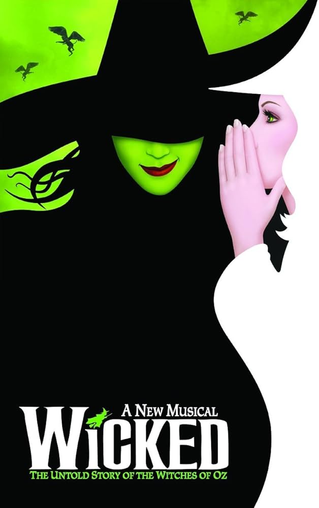
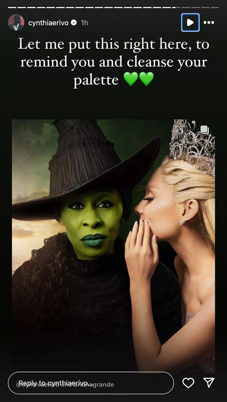
Fans customized the Wicked movie poster to more closely match the original Broadway poster.
Original Broadway Poster:
Movie poster:
Some fans, disappointed by the poster, altered it to be closer to the original, moving Grande’s hand and lowering the brim of Erivo’s hat to cover her eyes. The edits prompted Erivo to respond. “This is the wildest, most offensive thing I have seen
“None of this is funny. None of it is cute. It degrades me. It degrades us,” Erivo continued. “The original poster is an ILLUSTRATION. I am a real life human being, who chose to look right down the barrel of the camera to you, the viewer… because, without words we communicate with our eyes.”
So, this seems like a completely reasonable reaction to fans making fan content.


I think the fan edit is way better. First of all, the red lips add some much needed contrast to her face. The original makes her all green except for her eyes, which are mostly white and black. The red helps make the green appear more significant and distinct. I think they should change the background too for the same reason.
Hiding the eyes does dehumanize her, but that’s a good thing here. It makes her look sinister, and ascribes some character to her. The smile also helps. Her expression is so blank in the original that you can’t get any idea of what this character is. The fan edit tells a story, where the original is just a person.
That’s what I don’t get, it’s obviously the character. It’s not about who’s acting the character, but you’re the Wicked witch. One of the most iconic villains in all of history. The hat literally does speak more than the face