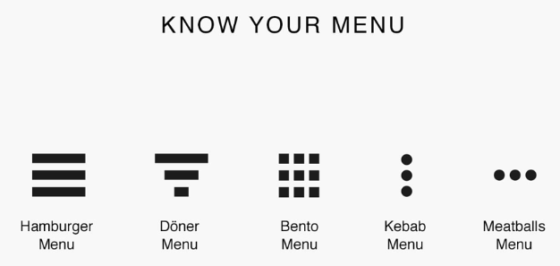
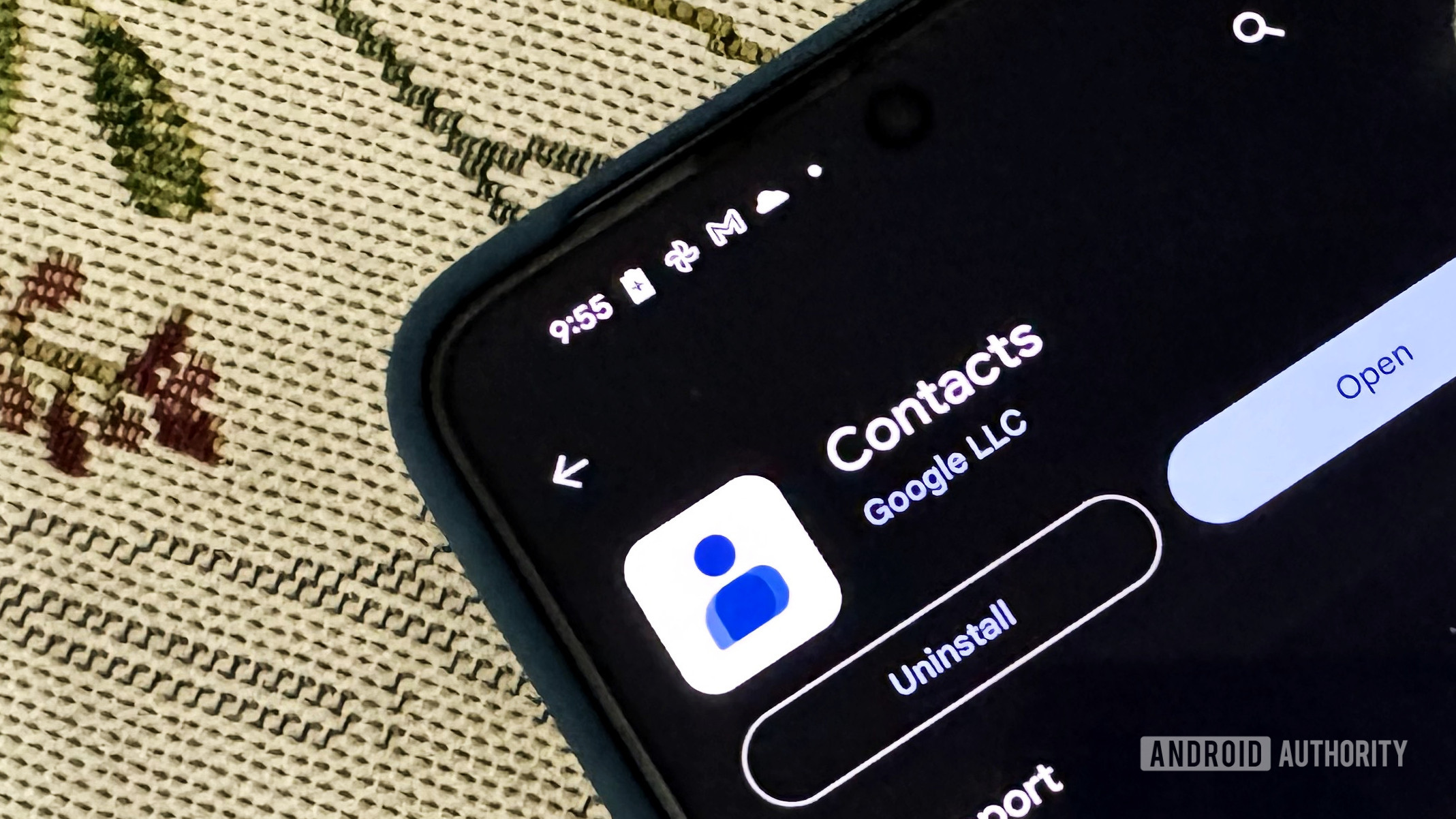
The Google Contacts app is getting a new UI for contact settings. These were previously available through the three-dot (meatballs) menu.
You must log in or # to comment.
Last I heard it was the hamburger menu.
They need to stop naming things that have no meaningful difference
No. A hamburger menu has bars, not dots.

Why?


